Label Layouts
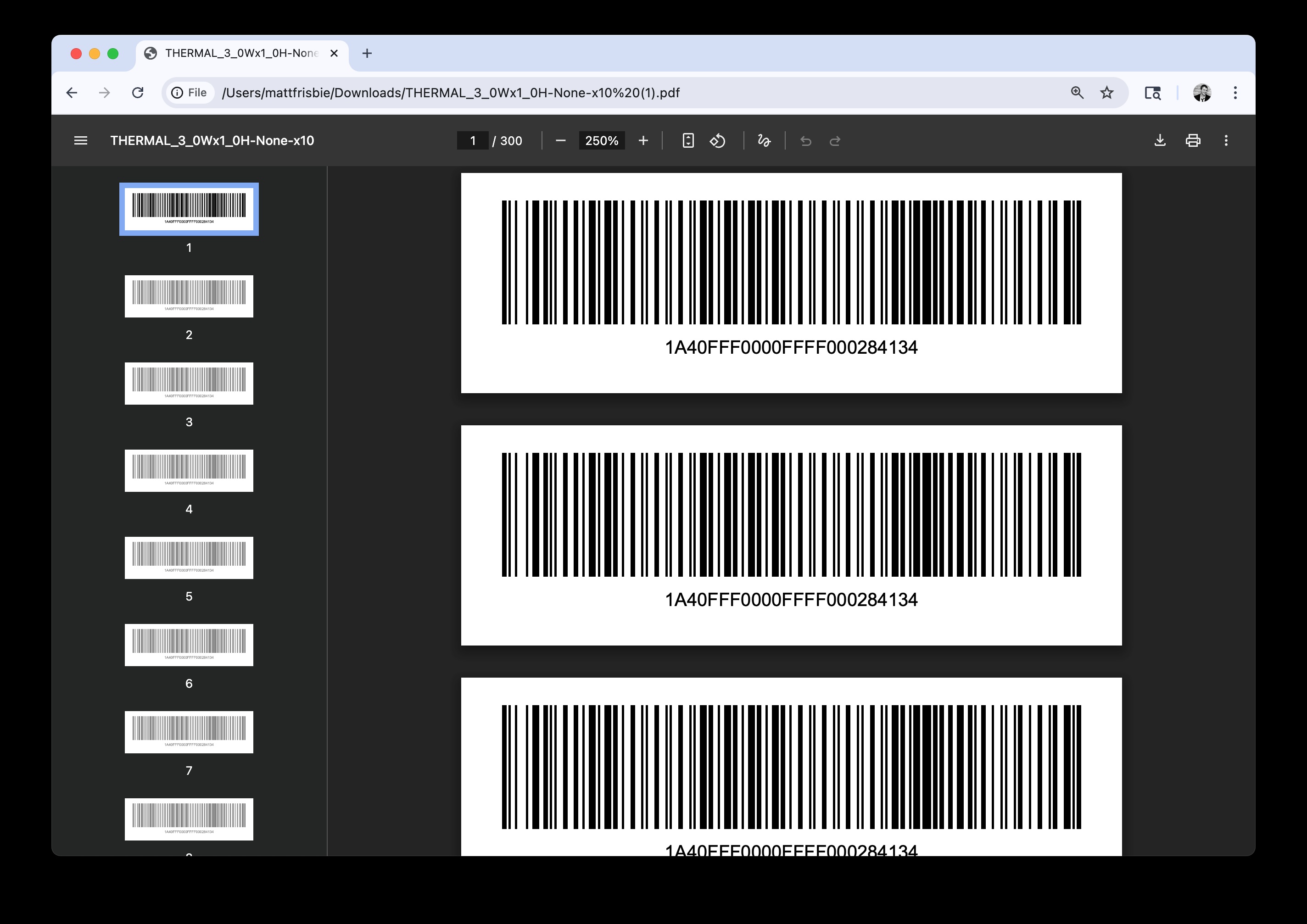
What a layout produces: a barcode and text, arranged on a 3x1 thermal label
Introduction
Layouts control what will be printed on each label and how it is arranged.
Things to know:
- Layouts can be static (each label is exactly the same) or dynamic (data is inserted into the label from the data list). Most commonly, layouts are a mix of both.
- Layouts are responsive, meaning they will resize to fit the template dimensions. Usually, they'll be designed to fit specific labels.
- Layouts are made up of one or more layout elements.
The entire label layout specification can be viewed here
Examples
Here is an example of a layout with a barcode in the top 75%, and text in the bottom 20%. Both the barcode and the text show a package label:
{
  "labelContentLayoutElements": [
    {
      "elementType": "CODE128_BARCODE",
      "valueTemplate": "{{package.label}}",
      "yStartFraction": 0.25
    },
    {
      "elementType": "TEXT",
      "valueTemplate": "{{package.label}}",
      "yEndFraction": 0.2
    }
  ]
}
Here is how this layout renders on a 3x1 thermal label:
Barcode/text layout rendered on 3x1 thermal label
Here is how this layout renders on an Avery 8160 label sheet:
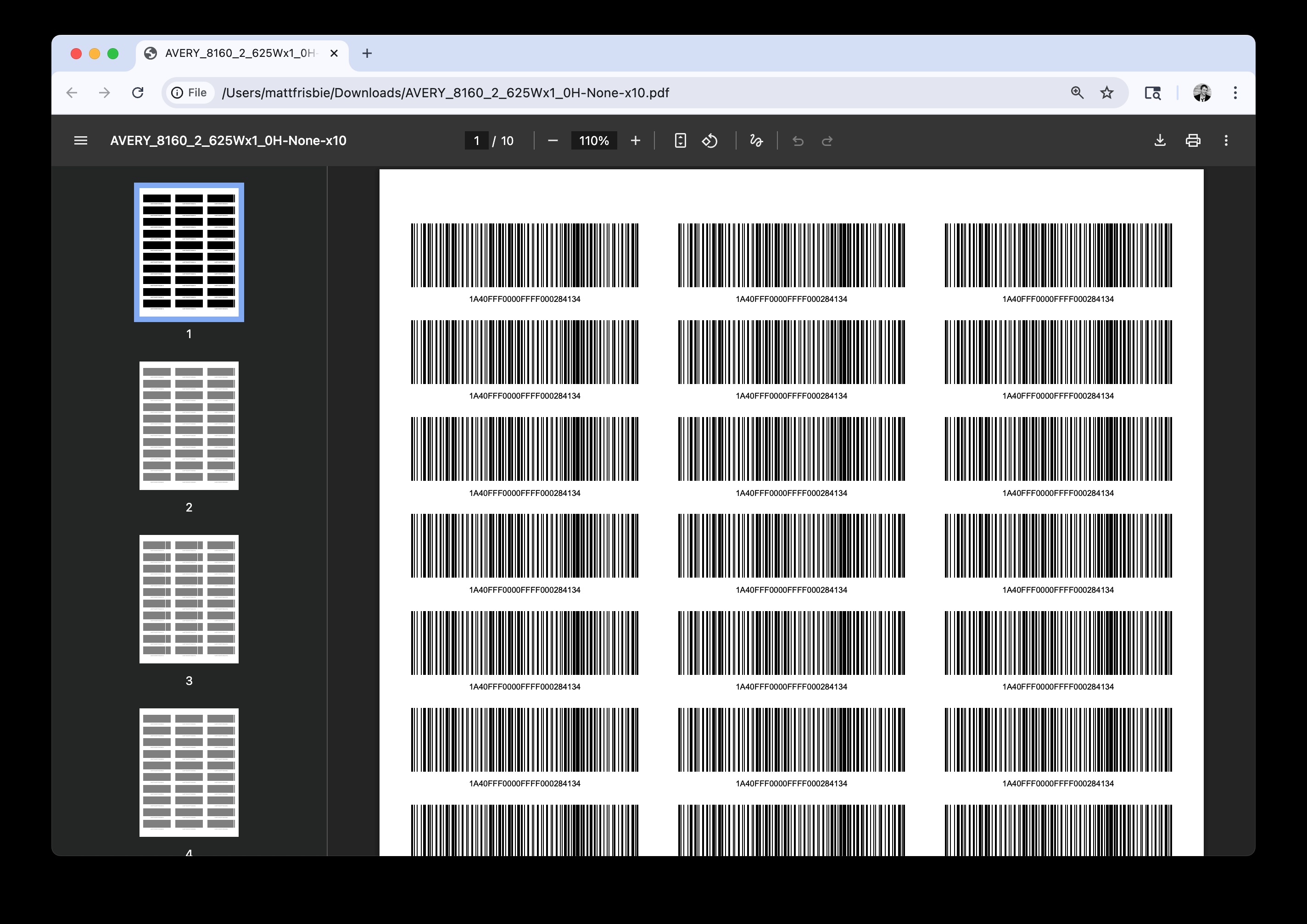
Barcode/text layout rendered on Avery 8160
Layout Elements
A layout element is a single element that appears somewhere on a label. Text, images, and barcodes are all examples of layout elements.
Each layout element has a specific elementType that describes how it will appear. Available element types:
elementType | Description |
|---|---|
TEXT | A paragraph of text |
TABLE | A table made of rows/columns of cells, defined with HTML |
IMAGE | An image file (passed as base64) |
CODE128_BARCODE | A Code 128 barcode |
CODE39_BARCODE | A Code 39 barcode |
QR_CODE | A QR code |
BOX | A rectangular box used for borders or background fills |
FRAGMENT | Another label layout, embedded inside this one |
Every element type also accepts the same four base fields, whatever else it supports:
| Field | Description |
|---|---|
elementType | Which of the types above this element is |
enabled | Set false to skip the element without deleting it. This is the eye toggle in the layer stack |
description | A free-text name for the element. It is not printed; it is how the element is labeled in the Label Studio, so a layout with more than a few elements stays readable |
xStartFraction, xEndFraction, yStartFraction, yEndFraction | The element's rectangle. See Position and Sizing |
elementType is the only required field. The API accepts the eight types above and rejects anything else, so a typo is reported rather than silently skipped. The Label Studio is more forgiving while you are editing: an element whose type it does not recognize is shown as Unknown with its position controls intact, so one bad element in a hand-edited layout leaves the rest of the layout editable.
Text
A TEXT layout element adds a paragraph of text.
Tables
A TABLE element adds multiple pieces of text formatted in rows and columns.
- All text in a table has a consistent font size and spacing.
- Table borders are not displayed by default.
- Tables are defined with HTML.
Images
An IMAGE layout element adds an image file onto the label.
- Images are centered in the layout element and fit to the available space.
- Image data is passed as base64 and accessed via filename (see value templates).
- The value template must resolve to usable image data. Unlike other element types, an
IMAGEthat renders blank is an error rather than an empty space. See Missing Images.
Barcodes
The CODE128_BARCODE and CODE39_BARCODE elements display a scannable 1D barcode that encodes a piece of text.
- The barcode will fill the layout element area horizontally and vertically.
- The barcode encodes whatever is produced by the value template.
- Use
CODE128_BARCODEfor Metrc tags and most general-purpose use.CODE39_BARCODEis available for systems that specifically require Code 39.
QR Codes
A QR_CODE element displays a scannable QR code that encodes a piece of text.
- QR codes are centered in the layout element and fit to the available space, with padding.
- The QR code encodes whatever is produced by the value template.
Boxes
A BOX element draws a rectangular box inside the layout element area. It does not use a value template.
boxStrokeColorsets the border color (hex, default#000000).boxStrokeWidthsets the border width in points (default0.5).boxStrokeAlphasets the border opacity (0.0–1.0, default1.0).boxBackgroundColorsets the fill color (hex). Omit to disable fill.boxBackgroundAlphasets the fill opacity (0.0–1.0, default1.0).
Fragments
A FRAGMENT element draws another layout inside its rectangle, so a block you use on many labels is written once instead of copied into each one. See Reusing Layouts With Fragments.
Position and Sizing
Layout elements are positioned as rectangles inside the printable area. The boundaries of the rectangle are specified as fractions of the label's printable width and height. This allows the same layout to be reused across labels of different sizes.
Layout elements use the following values to define size and position:
xStartFraction- left edge (default0)xEndFraction- right edge (default1)yStartFraction- bottom edge (default0)yEndFraction- top edge (default1)
Values are decimals between 0 and 1 (for example, 0.05 = 5% of the total dimension).
Note: The default start and end values fill the entire printable area. In the earlier example, only one fraction is defined for each layout element, the rest fall back to defaults.
Aspect Ratio Limits
By default, layouts will fill the available template width and height. You can define a minimum and maximum aspect ratio for the layout, which will limit how much it will stretch.
Layouts use two values to control this:
minAspectRatiomaxAspectRatio
Note: If T3 detects a minimum or maximum aspect ratio is reached, it will center the layout inside the template.
Reusing Layouts With Fragments
Most labels share blocks: a state warning panel, a barcode with its human-readable tag underneath, a facility footer. A fragment lets you write that block once and embed it in as many layouts as you like.
A fragment is not a special kind of object; it is an ordinary label layout. Anything you can print on its own can be embedded in another layout, and the layout you embed is exactly what GET /v2/labels/label-content-layouts returns.
Fragments work like images: send a map of named layouts alongside your request, then reference one by name from a FRAGMENT element.
{
  "labelContentLayoutConfig": {
    "labelContentLayoutElements": [
      {
        "elementType": "CODE128_BARCODE",
        "valueTemplate": "{{ package.label }}",
        "yStartFraction": 0.4
      },
      {
        "elementType": "FRAGMENT",
        "fragmentKey": "state_warning",
        "yStartFraction": 0,
        "yEndFraction": 0.35
      }
    ]
  },
  "fragments": {
    "state_warning": {
      "labelContentLayoutElements": [
        {
          "elementType": "TEXT",
          "valueTemplate": "{{ t3.text.poison_control_center_phone }}",
          "paragraphFontSize": 6,
          "yStartFraction": 0.5
        },
        {
          "elementType": "BOX",
          "boxStrokeWidth": 1
        }
      ]
    }
  },
  "renderingOptions": { "renderingVersion": 2 }
}
Positioning inside a fragment
A fragment fills its element's rectangle, and its own elements are positioned relative to that rectangle, not to the whole label. In the example above, the fragment occupies the bottom 35% of the label, so the TEXT at yStartFraction: 0.5 sits halfway up the fragment, not halfway up the label.
This is what makes a fragment portable: move the FRAGMENT element and everything inside it moves with it.
Aspect ratio
A fragment honors its own minAspectRatio and maxAspectRatio inside its rectangle, exactly as a layout does inside a label, so a block designed to be wide is not squeezed into a tall box. If the rectangle falls outside the fragment's limits, the fragment is centered within it.
The defaults are wide (0.1 and 10), so an ordinary layout used as a fragment will simply fill its rectangle. Set the limits on the fragment when its proportions matter.
Font sizes do not scale
paragraphFontSize is measured in points, so it is not affected by the size of the fragment's rectangle. A fragment written with 10pt text renders at 10pt whether it fills the label or sits in a narrow strip.
This is worth planning around, because barcodes, QR codes and images do scale to fit their element. Put text that needs to fit its box on paragraphTextResizeStrategy: SHRINK_TEXT (see Responsive Sizing).
Data
A fragment sees exactly the same data as the layout that embeds it, so {{ package.label }} means the same thing in both. There is no separate data list for a fragment.
Nesting and limits
A fragment can embed other fragments, up to five levels deep. Every fragment goes in the same flat fragments map no matter how deeply it is nested.
Requests are rejected with a 400 if:
- A
fragmentKeyis not in thefragmentsmap. The error lists the available keys and suggests near matches. - A fragment embeds itself, directly or through another fragment.
- Fragments are nested more than five levels deep.
- Fragments expand a single label past 500 elements.
renderingOptions.renderingVersionis not2. Fragments require version 2.
All of these are detected before anything is drawn, so a rejected request never produces a partial PDF.
Next Steps
- The full value syntax and every text option: Layout Element Values.
- Build a layout interactively in Layout Builder.
- Define the physical label in Label Templates.